
Start with materials that will remain
Brick, stone and roofing contain undertones that can make a colour feel warmer or cooler than it did on a small sample. Compare options directly against the house in natural light.
Consider window frames, garage trim and railings, but avoid matching everything automatically. A coordinated palette usually has hierarchy rather than one repeated colour.
Deep blue
A strong but familiar accent that works with many red-brick and neutral façades.
Charcoal or black
Creates crisp contrast and emphasizes panel geometry and hardware.
Warm neutral
Connects gently with stone, tan brick and natural exterior palettes.
Two-tone
Allows the exterior and foyer to coordinate without forcing one finish everywhere.
Notice light and exposure
A deeply covered porch can make dark colours appear nearly black, while strong afternoon sun can intensify warm tones and expose surface temperature concerns.
Product finish limits and maintenance instructions vary, especially for dark exterior colours. Confirm the finish system rather than assuming any paint colour can be applied to any door.
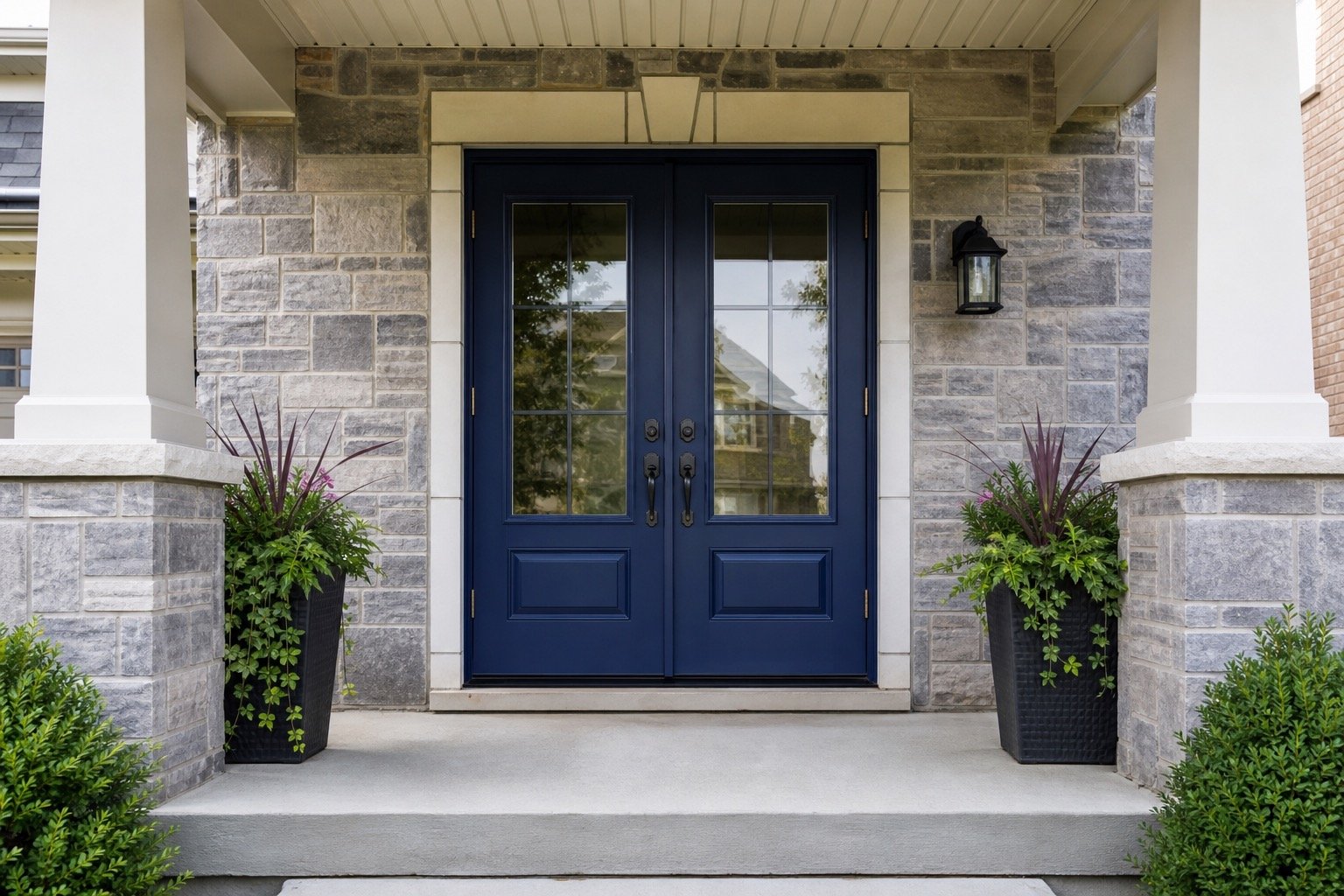
Coordinate both sides of the entrance
The exterior colour can be bold while the interior finish remains quiet. Two-tone options may help when the foyer palette and façade need different relationships.
Glass, hardware and sidelights also change how much colour is visible. Review a complete elevation and interior view before final ordering.
Plan the complete entrance
- Which exterior materials are staying?
- How much direct sun reaches the door?
- Should the entrance blend in or lead the palette?
- Will the interior and exterior use the same finish?
